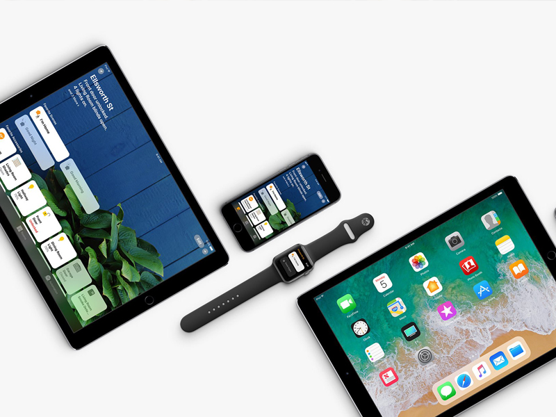
The evolution of mobile technology has drastically transformed the design process. Websites were erstwhile designed according desktop resolution standards but now in this Responsive Age, designers and developers are embracing mobile first approach. Responsive web design denotes fluid layouts and fluid grids to accommodate the screen sizes of assortment devices. No matter if you are viewing any website on desktop, laptop, tab or mobile device, responsive website looks flawless on every screen size. Since most of the population are on the go, it has become fundamental to craft web projects that are compatible with the handy electronic devices.
Shaping websites for varied screens and every new device cropping up in the market is beyond the bounds of possibility. That is a why the digital architects are blessed with an approach like responsive design that automatically optimises the website as per user preference.
If you are new or tenderfoot in responsive designing, here are few guidelines that will help you to craft perfect custom-made web solutions:
Follow the Mobile-First Approach
Start from small screen designing and then scale up to desktop version. Since mobile devices are much handy than desktops, almost 1 out of every 5 people access websites via smartphones. In order to offer maximum user interaction, ensure the shaped layout is compatible with mobile browsers. It is assumed that mobile design is toughest and has to be done first. If it works for mobile, desktop design without much effort will come out good.
Flexible Layout
If you are designing for assorted screen sizes, keep the layout fluid. Flexible layouts will fit any screen resolution or orientation. Fluid layouts are calculated in percentages, hence there is no need to consider screen width as the design size will by default adapt the size of the device used. Layout designed on basis of percentage can be easily rearranged.
Cut Down the Unwanted Elements
For enhanced user experience and also to accelerate the website speed, it is necessary to eliminate the unwanted elements. Too many elements will make the site look cluttered. Only focus on aspects that are necessary for users.
Hide Content
Long scrolling pages with loads of content is absolutely boring especially when it is encountered on mobile screens. People would instantly leave the site. Since the screen gets smaller, it becomes necessary to trim down on the text. Condense the content and instead of multiple columns, place the content in list or rows. CSS smoothly and easily allows showing or hiding content.
Optimised Images
For improved mobile experience, image sizing, cropping and optimising plays a very important role. Optimised images will also have positive impact on site speed. Image optimisation will deliver compelling performance.
Follow SEO practices
Some responsive websites are not SEO-friendly, this can be a main drawback. You cannot overlook the fact that 40% of search results come from mobile devices. Usually the searched keywords are short when it comes from smartphones, so target and integrate such keywords. Make your responsive websites content-rich and incorporate important keywords in site content too. To display crucial names and links, use text instead of images as Google doesn’t crawl text in images.
The custom web solution – responsive websites is best practice. Mobile-friendly designing is not a choice but a necessity. These basics will help you to offer better digital experience for todays and future users.


