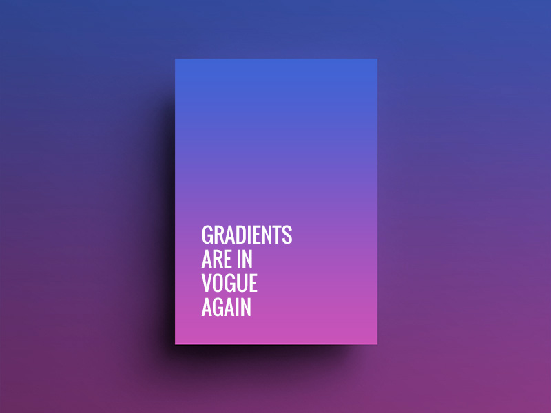
It seems like the era of flat designs has come to an end or the trend is slowly declining. After a long supremacy of flat colours, gradients mark a grand come back in web designing. The gradual blend of shades of same colour is now seen in most of the websites and even prominent brands are incorporating the dual-tone gradients. This simple feature can create major visual appeal with its bold and bright presence. The comeback version of gradients is all upgraded as web-designers are now integrating this colour pattern with flat design.
Gradients can be seen popping up in most of the latest websites with a little oomph. Even the biggest brands are welcoming gradients back on their website. This design style can be seen in one or the other way. Either the shades of colour are splashed all over the background or are seen adding effect to the smallest web elements like button border.
Let’s see how this simple visual display can become attention-grabbing:
Big background images with gradients:
To inject life and depth to the websites, designers are incorporating background images with gradient effect. If you notice, forest is filed with different tones of green; similarly other nature elements like sun, sky also look pleasing with shades of colour. To add such realism to the background images, the concept of gradients is incorporated.
Fonts with gradients:
As we mentioned before, right from the biggest element like image background to the smallest element – font can be seen immersed in gradients. Giving type a gradient effect has become a much popular design style. Text with gradient looks classy and contemporary but only if right colour shades are used. Use gradient text colours that are contrast to the background. It will not only look appealing but also will be better for readability purpose.
Images with gradient colour overlay:
The trend of images with single colour overlay is now shifting to gradients overlay. This design trend can be used effectively to lay focus on elements like hero image or call-to-action button. It is necessary to create perfect balance between image and colours.
Button border with gradients:
Button border with gradients is minimal but creates a great impact on the visitors. It calls for attention and also enhances user experience. It is really creative way to style the buttons.
Trick to use gradients commendably:
- Gradients should appear invisible. Gradients should not actually look like gradients to the viewer. It should just attract the visitors by its aesthetic appeal. So don’t make the gradient look too obvious.
- Using gradients in the smallest elements like icon is not recommended. As it is not only harder to identify as a user, it can be distracting too and affect user experience.
- On the other hand, gradients for larger elements like oversized buttons or Call-to-action buttons is strongly recommended as it instantly grabs attention.
When gradients went out of fad, many designers were disheartened. However its return with a bang has certainly excited many creative professionals. Trends in designing are always welcomed, especially when it is return of in demand trends like gradients.


